

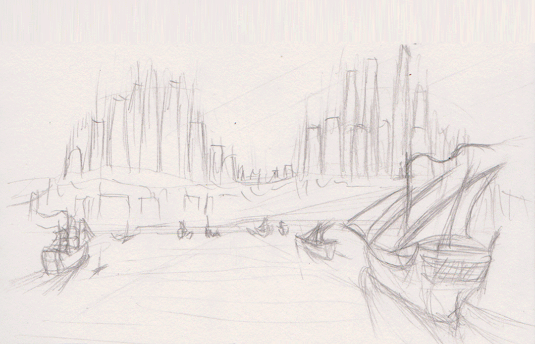
I think I spent most of the morning as well as a chunk of last night getting the sea in the exterior establishing shot right in a way that looks good but thank you to @Stitch and @Simon for giving me suggestions and pointers, as well as suggestions from a couple of third-years. The current look was based on a reference (seen included in one of the frames to give me an idea of how to do it) as well as some in-depth look into ship wakes which unfortunately was not easy as my attempts with google heralded either the wakes from powered boats and ships, or shots of tallships themselves and not their wakes. Luckily I did come across one image that was intended to show the types of wakes that are made by the ships of various speeds and sizes. This has probably been the most annoying part so far but at the same time it was a rewarding challenge as it does look a bit more like something from an oil painting (I chould add a few highlights on the bodies of water on the left and right edges but at the same time their lack of detail does draw the eye towards the centre and the city itself.
I really needed to get myself moving so I spent this evening working on the interior establishing shot as well as some outfit designs for Despina's citizens. The interior establishing shot is still pretty flat as I will add depth later along with a wide variety of other goods on display which will include stuff in crates in the main aisle. Although so far this process of flat colouring has been good with working out what part of the images I don't need to give detail to. I added fabric canopies to the bazaar roof for two reasons:
- The first is that I realised one of the reasons that such bazaars might have opaque rooves is to provide shade and protect from gusts of sand, and a glass ceiling would have made the promenades unbearable i nthe middle of the day. The I wasn't quite sure about losing the glass ceiling so I compromised with canopies that provide shade but do not fully envolop the place in darkness.
- The second reason, which was more of a convenience, is I can save time by using the canopies ot blot out sizeable areas of the ceiling, leaving only small patches to add detail to. I plan to make the canopies appear thin enough that they act as a blue filter for ligth shining though, adding a cool tone to the whole area to compliment the warm(ish) green and beige.

For the outfits I was inclined on a mix of western and middle-eastern fashions to reflect that this is a city that is a melting pot of the two cultural identities. There's also the possibility that there is a sizeable tourist population in the city due to its attractiveness and its ameniaties. There's possibly some more Southern/Eastern asian influences in at least one or tw oof these outfits as well. GIven that the focus should be on the city, I might use these ideas to give outline rather than go all-out and make the people as brightly-coloured and as eye-catching as the city.
I have also been going into some thought for the low-angle shot which could end up looking the busiest and would lead into the interior establishing shot by having part of the bazaar building open up int othe city streets. I definitely plan tp combine aspects my two considered thumbnails as well as considerations as to what kind of stories Despina's citizens will be telling via dress, body language and interaction with each other. I just need to keep mindful that I only have a little less than a week to finish this all up and make it presentable which I didn't unfortunately do last time.
In preparation for the presenation I have thought a bit about the look of the document although this is still fairly early so I don't hav e much to say other than the tohught of the background being perhaps dark to bring out the bright colours that are predominant in the pieces I have done.
Hey Mark,
ReplyDeleteOkay good, the water looks more lively its already much more pleasing. You should probably punch up the froth around the boats make that white stand out a bit more... Try to create a kind of hard surface spatter effect so things don't get blurry, I'm sure you know about creating custom brushes but if you don't try googling it you will find about 20,000 tutorials about it. From there you can create your own "Froth brush" etc and use it to bump up the hardness of your waves so they don't look "soft and merged".
You should also consider the rock formation itself... waves would be hitting that and it doesn't look far enough away so they would not be visible... Its not a big issue but it would help ground your rock in the water. Now considering your waves you may wish to apply the same notion to the sky... maybe adding clouds or punching up the saturation.
In other news your interior is pretty nice much harder (you seem to be avoiding the softness here and that's good). I especially love the shadows of your arches That's the kind of thing you should be adopting for everything. You need to lose some of the hardness and counter it with hard shadows for architectural beams, walls, etc. You can be a little more lax with organics (drapery and so on). But remember the shadows are not fluffy...
You are doing much better, keep up the good work!!
xXStItChXx
I love the interior design! Very bright and welcoming.On your ship piece, I agree with Stitch, the frothing needs a little more ''umph'' to really give those ships some clarity. As well as on the rocks too. And remember what I said in Simon's tutorial about giving the ships some where to go, it still looks to me as if the ships are going to hit the wall of rocks. They need a destination that doesn't mean shipwrecked aha :)
ReplyDelete